2.3
Mobile-first hero
A phone-shaped preview makes the visual system memorable while still keeping the booking CTA close to the top of the page.
2.0 Portfolio / Local Services
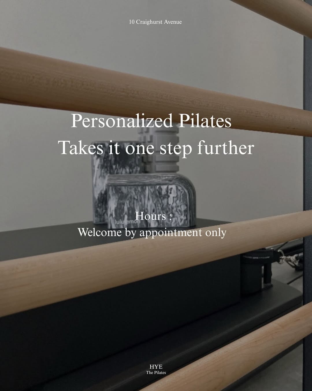
A polished studio website demo for a Toronto Pilates brand, built around quiet visuals, social proof, and a direct path from interest to inquiry.
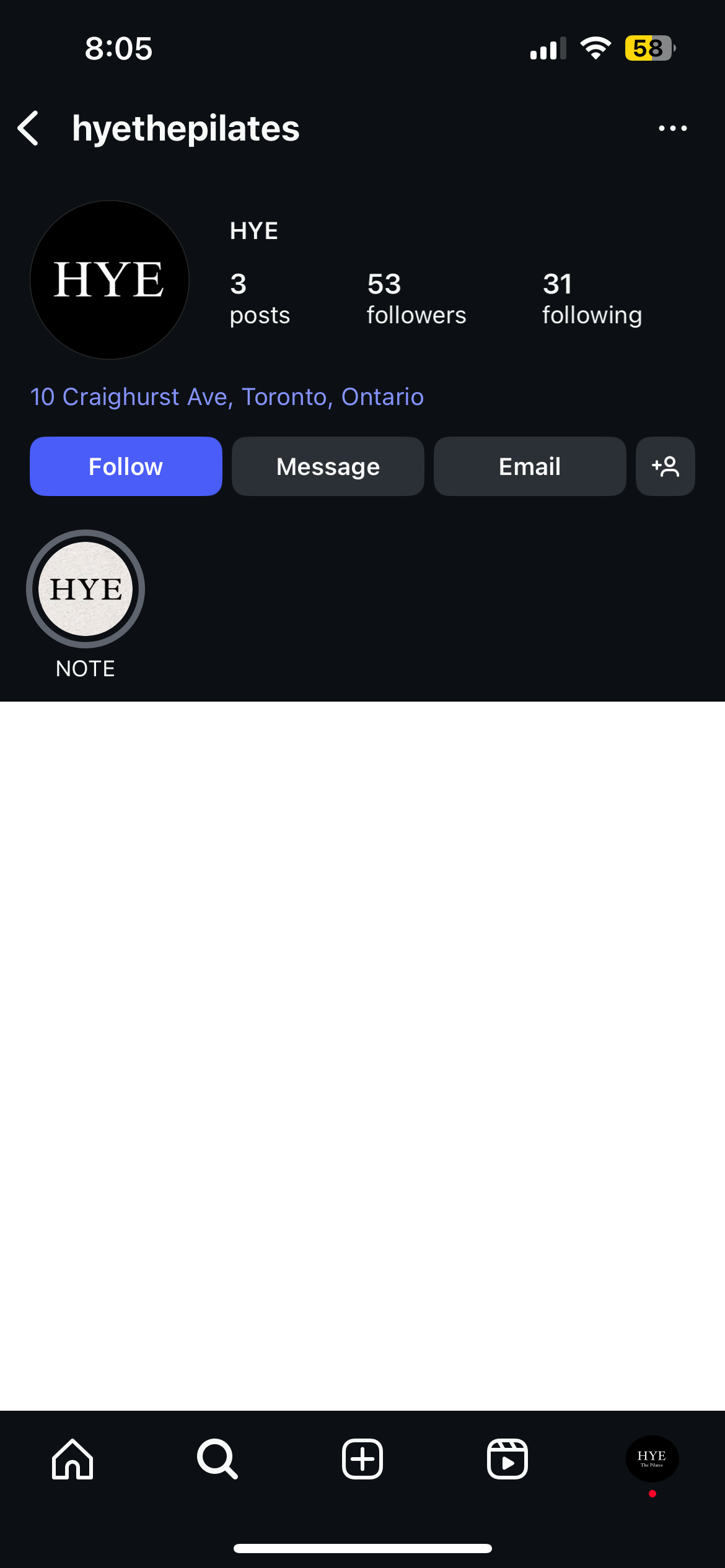
The page introduces HYE with a calm first viewport, clear appointment context, and an Instagram-inspired mobile preview that makes the studio feel current without making the interface loud.
The work page now acts as the portfolio wrapper: concise context for search visitors, then a direct path into the actual live demo.
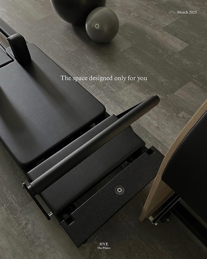
The demo prioritizes the things a prospective client needs quickly: where the studio is, what the sessions feel like, what others say, and how to start a conversation.
2.3
A phone-shaped preview makes the visual system memorable while still keeping the booking CTA close to the top of the page.
2.4
Warm photography and controlled typography help the page feel personal, appointment-based, and calm.
2.5
Primary actions stay focused on booking or exploring sessions instead of scattering attention across many links.
2.6
The Instagram treatment and testimonial motion give the demo a familiar, client-facing rhythm.
The visuals come from the demo itself, so the portfolio page previews the actual experience instead of relying on a disconnected logo tile.

View the HYE Pilates demo as a complete standalone website experience.